
So I decided to learn React Native while making an app that would come in handy for me.
See, I like to keep a little checklist on my phone of all the different items that I need to take with me to work, so I don’t have to think every morning. I use Google Keep for this, and while it works fine, I want it to reset as soon as I’ve checked all the items, so all the items are automatically unchecked for the next day. So I decided to make an app!
I’m using React Native for this because I’ve been meaning to learn React Native for a while now, and what better way to learn than to solve your own little problems?
Let’s begin!
Hello, world!
Let’s start by installing expo-cli as it’s the easiest way to get started.
npm install -g expo-cliNow we’ll initialize our app itself.
$ expo init DailyChecklist
? Choose a template:
  ----- Managed workflow -----
❯ blank         minimal dependencies to run and an empty root component
  tabs          several example screens and tabs using react-navigation
  ----- Bare workflow -----
bare-minimum minimal setup for using unimodules Let’s choose blank template, and name our app. I’ll call it “Daily checklist”.
To keep things simple, I’ll try to stick to core React Native and avoid using Redux or anything like that for now.
Let’s start the app.
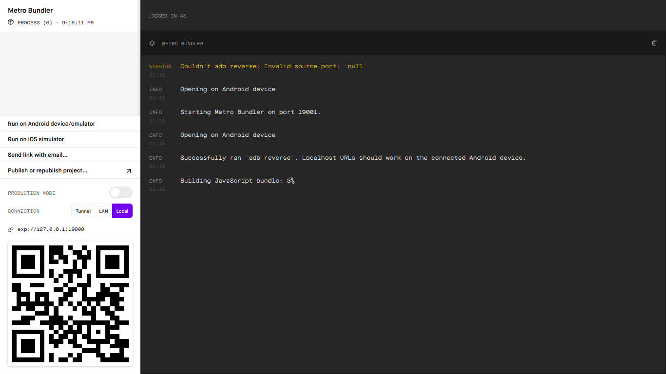
npm startSo now we have a couple of options as to how to run and “hotload” the app from the computer to the device. In decreasing order of speed: if you have a USB cable available with an Android device, you can choose the “Local” option. If your phone and computer are both connected to the same WiFi or LAN, choose LAN. Otherwise, choose Tunnel. I chose the “Local” option since it’s the fastest. You should see something like below:
Let’s make a few changes in our App.js file.
...
  render() {
    return (
      <View style={styles.container}>
        <Text>Hello React Native!</Text>
      </View>
    );
  }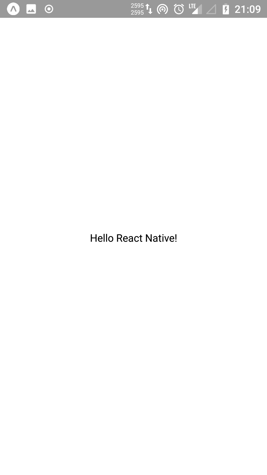
...If everything went well, the app on your phone should update automatically. This is called “hot reloading”, and it’s one of the neat things I like about React Native.
It works! Not very interesting, though. Let’s get ourselves some checkboxes.
Adding checkboxes
Now the CheckBox component offered with React Native works only on Android, but that’s fine in my case because I’m only working on the Android app for now. It shouldn’t be too hard to swap it out with a cross-platform component if needs be.
import React from "react";
import { StyleSheet, CheckBox, Text, View } from "react-native";

export default class App extends React.Component {
  render() {
    return (
      <View style={styles.container}>
        <View style={{ flexDirection: "row" }}>
          <CheckBox />
          <Text style={{ marginTop: "auto", marginBottom: "auto" }}>Hello</Text>
        </View>
      </View>
    );
  }
}

const styles = StyleSheet.create({
  container: {
    flex: 1,
    backgroundColor: "#fff",
    alignItems: "center",
    justifyContent: "center",
  },
});So we have a check box! Now let’s make that into a reusable component, and then render a bunch of these.
import React from "react";
import { StyleSheet, CheckBox, Text, View } from "react-native";

const Item = ({ checked, value }) => (
  <View style={{ flexDirection: "row" }}>
    <CheckBox value={checked} />
    <Text style={{ marginTop: "auto", marginBottom: "auto" }}>{value}</Text>
  </View>
);

export default class App extends React.Component {
  render() {
    return (
      <View style={styles.container}>
        <Item checked={true} value="Item 1" />
        <Item checked={false} value="Item 2" />
        <Item checked={true} value="Item 3" />
      </View>
    );
  }
}

const styles = StyleSheet.create({
  container: {
    flex: 1,
    backgroundColor: "#fff",
    alignItems: "center",
    justifyContent: "center",
  },
});That’s great, but right now you can’t uncheck a box once checked, and vice versa. This is because we need to update CheckBox‘s value ourselves, using the callback we provide to onValueChange.
import React from "react";
import { StyleSheet, CheckBox, Text, View } from "react-native";

const Item = ({ checked, onValueChange, value }) => (
  <View style={{ flexDirection: "row" }}>
    <CheckBox
      value={checked}
      onValueChange={onValueChange}
    />
    <Text style={{ marginTop: "auto", marginBottom: "auto" }}>{value}</Text>
  </View>
);

export default class App extends React.Component {
  state = {
    items: [
      { value: "Phone charger", checked: true },
      { value: "Notebook", checked: false },
      { value: "Pen", checked: false },
    ],
  };

  checkItem = index => {
    this.setState(({ items }) => ({
      items: items.map((item, currentIndex) => {
        if (index === currentIndex) {
          return { ...item, checked: !item.checked };
        }
        return item;
      }),
    }));
  };

  render() {
    return (
      <View style={styles.container}>
        {this.state.items.map(({ checked, value }, index) => (
          <Item
            key={index}
            checked={checked}
            value={value}
            onValueChange={() => this.checkItem(index)}
          />
        ))}
      </View>
    );
  }
}

const styles = StyleSheet.create({
  container: {
    flex: 1,
    backgroundColor: "#fff",
    alignItems: "center",
    justifyContent: "center",
  },
});I added a new function called checkItem that checks or unchecks an item based on its index. To do this, I use React’s setState with callback. Then I passed it as a callback function to Item‘s onValueChange prop.
So our checkboxes work, that’s great! But we can’t add any items of our own yet. Let’s fix that.
Adding new items
Let’s add a TextInput component for, well, text input. And let’s store whatever the user types in this field in a state variable. We’ll also add a button. Pressing this button will add the new item to our list.
First, let’s add the state variable to store user input:
...
export default class App extends React.Component {
  state = {
    items = [],
    newItemText: '',
  }
...Now we’ll add the functions to add items. handleNewItemTextChange is to store the input of TextInput in state. handleAddButtonPress gets called when user clicks the “Add” button, which we also defined below.
  handleNewItemTextChange = newItemText => {
    this.setState({ newItemText });
  };

  handleAddButtonPress = e => {
    const newItemText = this.state.newItemText.trim();
    if (newItemText) {
      this.addItem(newItemText);
      this.setState({ newItemText: '' });
    }
  }
...
  <TextInput
    style={styles.inputText}
    placeholder="Add new item..."
    value={this.state.newItemText}
    onChangeText={this.handleNewItemTextChange}
    onSubmitEditing={this.handleAddButtonPress}
    blurOnSubmit={false}
  />
  <Button
    style={styles.addButton}
    onPress={this.handleAddButtonPress}
    title="Add"
/>We use onSubmitEditing to make sure that the soft keyboard’s “Go” action also works for adding the new item. It’s the button you usually see at the bottom right corner of soft keyboards on Android.
Great! We can check items, uncheck them and even add new ones. Now let’s add the feature to delete items.
Deleting items
To keep things simple, we’ll ask user for confirmation on long press of the item text. User can then either confirm deletion, or cancel.
First, let’s define the functions to delete the item, and to confirm the deletion with an alert dialog.
  deleteItem = index => {
    console.log('Deleting item of index ', index);
    this.setState(({ items }) => ({
      items: items.filter((item, _index) => index !== _index),
    }));
  };

  confirmDeleteItem = index => {
    console.log('confirming deletion of item of index', index);
    const itemText = this.state.items[index].value;
    Alert.alert(
      null,
      `Are you sure you want to delete item '${itemText}'?`,
      [
        { text: 'Cancel' },
        { text: 'Delete', onPress: () => this.deleteItem(index) },
      ],
      { cancelable: true },
    );
  };
Next, we’ll modify our Item component to accept the prop onLongPress.
const Item = ({ checked, onValueChange, value, onLongPress }) => (
  <View style={{ flexDirection: 'row' }}>
    <CheckBox value={checked} onValueChange={onValueChange} />
    <Text style={styles.itemText} onLongPress={onLongPress}>
      {value}
    </Text>
  </View>
); Now we’ll define our long press handler function and pass it to our Item component.
  handleItemLongPress = index => {
    const itemText = this.state.items[index].value;
    Alert.alert(
      itemText,
      'Please select an action.',
      [
        { text: 'Cancel' },
        { text: 'Delete', onPress: () => this.confirmDeleteItem(index) },
      ],
      { cancelable: true },
    );
  };
...
<Item
  key={index}
  checked={checked}
  value={value}
  onValueChange={() => this.checkItem(index)}
  onLongPress={() => this.handleItemLongPress(index)}
/>
...Neat! Now let’s add the feature to edit items.
Editing items
As before, let’s add the function to actually modify the state so that items can get edited.
editItem = (index, value) => {
this.setState(
({ items }) => ({
items: items.map((item, currentIndex) => {
if (index === currentIndex) {
return { ...item, value };
}
return item;
}),
}),
() => this.persistItems(),
);
};As before, let’s add the function to actually modify the state so that items can get edited.
editItem = (index, value) => {
this.setState(
({ items }) => ({
items: items.map((item, currentIndex) => {
if (index === currentIndex) {
return { ...item, value };
}
return item;
}),
}),
() => this.persistItems(),
);
};const Item = ({ checked, onValueChange, value, onLongPress }) => (
<View style={{ flexDirection: 'row' }}>
<CheckBox value={checked} onValueChange={onValueChange} />
<Text style={styles.itemText} onLongPress={onLongPress}>
{value}
</Text>
</View>
); Now we’ll define our long press handler function and pass it to our Item component.
  handleItemLongPress = index => {
    const itemText = this.state.items[index].value;
    Alert.alert(
      itemText,
      'Please select an action.',
      [
        { text: 'Cancel' },
        { text: 'Delete', onPress: () => this.confirmDeleteItem(index) },
      ],
      { cancelable: true },
    );
  };
...
<Item
  key={index}
  checked={checked}
  value={value}
  onValueChange={() => this.checkItem(index)}
  onLongPress={() => this.handleItemLongPress(index)}
/>
...
Neat! Now let’s add the feature to edit items.
Editing items
As before, let’s add the function to actually modify the state so that items can get edited.
  editItem = (index, value) => {
    this.setState(
      ({ items }) => ({
        items: items.map((item, currentIndex) => {
          if (index === currentIndex) {
            return { ...item, value };
          }
          return item;
        }),
      }),
      () => this.persistItems(),
    );
}; It’s fairly simple. When called, it’ll edit the item specified by index to value.
Now let’s add a wrapper function around this that gets called when user clicks on the “Edit” button.
handleEditButtonPress = () => {
  this.editItem(this.state.editItemIndex, this.state.editItemText);
  this.setState({ confirmEditModalVisible: false });
};Now to edit items, we need another input field, where we can type in the new value. To accommodate this input field, we’ll use a Modal component:
import { Modal } from 'react-native';
...
      <View style={styles.container}>
        <Modal
          animationType="slide"
          transparent={false}
          visible={this.state.confirmEditModalVisible}
          onRequestClose={() =>
            this.setState({ confirmEditModalVisible: false })
          }
        >
          <View>
            <TextInput
              style={styles.inputText}
              placeholder="Edit item..."
              value={this.state.editItemText}
              onChangeText={this.handleEditItemTextChange}
              onSubmitEditing={this.handleEditButtonPress}
              blurOnSubmit={false}
            />
            <Button
              style={styles.addButton}
              onPress={this.handleEditButtonPress}
              title="Save"
              disabled={!this.state.editItemText.trim()}
            />
          </View>
        </Modal>
        {this.state.items.map(({ checked, value }, index) => (
...Here, we’ve added a new Modal component, with a View component inside of it. This View component contains the main UI of what the modal will contain. It has a TextInput and a Button.
We’ve added a bunch of new state variables and functions here. Let’s go ahead and define those.
...
  state = {
    ...
    editItemText: '',
    editItemIndex: null,
    confirmEditModalVisible: false,
  }

...

  handleEditItemTextChange = editItemText => {
    this.setState({ editItemText });
  };

...editItemText contains the text entered in the TextInput field above. editItemIndex holds the index of the item being edited. confirmEditModalVisible indicates whether or not the modal is visible.
Let’s add another function actually show the modal. We’ll reuse our handleItemLongPress function for this.
  confirmEditItem = index => {
    const editItemText = this.state.items[index].value;
    this.setState({
      confirmEditModalVisible: true,
      editItemText,
      editItemIndex: index,
    });
  };

  handleItemLongPress = index => {
    const itemText = this.state.items[index].value;
    Alert.alert(
      itemText,
      'Please select an action.',
      [
        { text: 'Cancel' },
        { text: 'Delete', onPress: () => this.confirmDeleteItem(index) },
        { text: 'Edit', onPress: () => this.confirmEditItem(index) },
      ],
      { cancelable: true },
    );
};Now you should be able to edit items by long pressing an item and choosing “Edit”.
Source code
Hope this article was helpful. For reference, the completed source code of the app is available here.
Thank you!!1
Thank you!!1
Thank you!!1